Santa Esmeralda
Vinyl Redesign
In this project, I was tasked to deliver a redesign of a band unfamiliar to me. It was encouraged to go to local vinyl stores and thrift stores to check what artists would be available. From the vinyl display at my local thrift store, I chose the band, Santa Esmeralda to redesign because the original physical copy I purchased was so simple with a blank white vinyl sleeve with only the record company's logo that was distributing it - I felt that there was room of possibilities for me to explore.
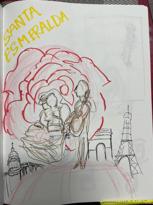
In my digital iterations, I used stock images to support the narrative of how Santa Esmeralda's rise to success came to be. For the composition of the donkey, I was inspired by their song, Don't Let Me Be Misunderstood, with the musical composition having Latin and flamenco flare as a disco group. I wanted to depict that into an illustration of the listener in a Western desert on a journey of uncertainty. In the typography, I wanted to reflect the Latin inspired narrative with flowing script font and the bold sans serif font that is emblematic of Mexican fast-food restaurants.
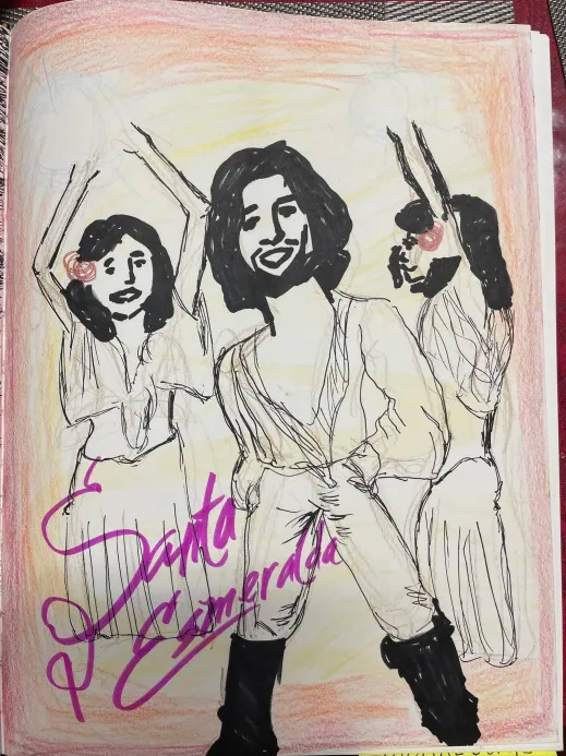
For the composition of the woman, I chose her to personify Santa Esmeralda's muse of their songs. Inspired by existing albums of Santa Esmeralda that used warm colors, I did the same and tried colors that complimented the tones of the woman and the rose in her hair. With the background gradient, it is reminiscent of a sun as if she's a beacon of light. I used serif fonts to depict an elegance and used a display font for the logotype the imitated other disco bands of the era.
This design was visually interesting, however the type elements needed better structure for an anchoring from the logotype to the songs and the text of the Greatest Hits to help navigate the viewer's readability.
Concept 2: Woman in Warm Colors
This is my final mockup of the concept with the donkey and the desert. This was the better design between both compositions as I incorporated the type in the development of the grid and conceptualizing the narrative to work together.
Concept 1: Donkey in the Desert
Vinyl Mockups
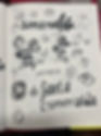
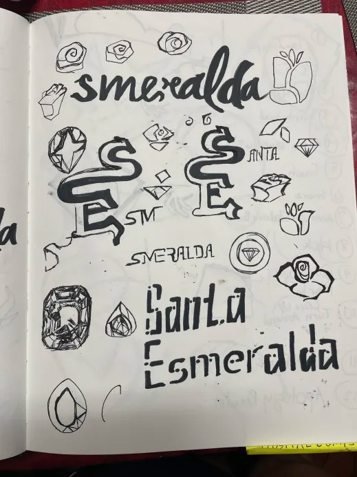
Sketches
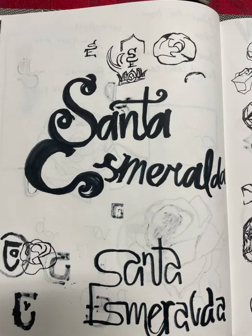
In my hand drawn sketches I was envisioning how to redesign Santa Esmeralda's logotype and use visual themes that are existing in their albums like warm colors, roses, centering the lead singer in the frame of the design. I also had the idea of drawing jewels like an emerald from the name Esmeralda, but these concepts did not go through my final stages of redesigning the vinyl sleeve.


